Popular Topics
Choose
Popular Links
Congratulations, Lasse and Carol!
updated by rck, 2005-09-11

A couple of weeks ago, Andrew Patterson started a phpWebSite contest. The judges Sharon Renshaw and Shawn Murray were found rather quickly, people started working on their submissions. The goal was finding a new look for a new portal.
phpWebSite themes is the new project from the creators of phpwebsitemanual.com and will focus on phpWebSite themes. I'm already curious how it will turn out and wish all involved parties the best of luck!
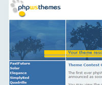
The Dark Trees theme
This theme has something that the other 5 didn't have. I don't know wether you've noticed it, but the colours perfectly match the current phpwebsite manual site and thus underline the connection between those two sites. Instead of red as highlight colour lasse used yellow here and created a well-balanced, non-intrusive theme.The only thing I don't really like about �Dark Trees� is the lack of padding for the menu and the login-box. Then again, that's a minor issue that can be fixed quite easily. I'm already curious, how the developement team of phpWebSite will use the USD 50. Lasse stated on his contest entry, that he would donate the money to the phpws dev team.
Under the hood | |
|---|---|
|
Technically speaking, Dark Trees is using a table-based layout. All the widths and heights of the layout are fixed, obviously Lasse used Macromedias Dreamweaver for creating the theme. The markup isn't 100 % valid; there's for example one missing closing tr tag. Lasse doesn't even use a doctype and there are a couple of other minor issues. The three icons on top (home, sitemap and mailto) are actually an image-map, a technique that's not that common anymore these days. From a graphical point of view, this theme doesn't look like phpNuke at all. If someone tells you all Nuke sites look the same, show him/her this theme. |
|
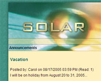
Solar
I really like the colours of Carols theme. You don't see a combination of marble-green, red and a yellowish-orange every day. This theme is busier than Lasses, maybe because of the lot of colours used here?I also think, that the menu highlighting gives a nice touch to the whole theme. Solar makes an more extroverted impression on me than Dark Trees and would probably be very suited to be used on a community site of some sort.
Under the hood | |
|---|---|
| Carols theme validates, there's not a single warning on it. Like Lasse, Carol is using a table-based layout. But she has touches of CSS styling in it at various places. There are not too many surprises in Carols source code, everything is clean and tidy. | |
| The comments are owned by the poster. We are not responsible for its content. |

What's Related
Article Manager
Themes
Latest Updates
AdministrativeTexts
updated by freddiemac1993, 2013-06-14
wiki
Re: adventures
created by brittdavis10, 2012-02-23 (1 rply, 3 views)
thread
Re: how to run phpwebsite...
created by alexander, 2011-08-25 (2 rpls, 3607 views)
thread
Re: Forum tags
created by HaroldFaragher, 2011-08-22 (3 rpls, 8488 views)
thread


