Popular Topics
Choose
Popular Links
Congratulations, Lasse and Carol!
updated by rck, 2005-09-11

A couple of weeks ago, Andrew Patterson started a phpWebSite contest. The judges Sharon Renshaw and Shawn Murray were found rather quickly, people started working on their submissions. The goal was finding a new look for a new portal.
phpWebSite themes is the new project from the creators of phpwebsitemanual.com and will focus on phpWebSite themes. I'm already curious how it will turn out and wish all involved parties the best of luck!
The other themes | |
|---|---|
| What about the other four entries? Before they will get lost and forgotten, I'd like to do a few quick comments on them. | |
Elegance
Carol submitted a second theme. It's called Elegance and has more conservative colours than Solar. My first association: Some antiques-shop with a lot of excellent second (or third or fourth) hand goods. Like old furniture or toys, etc. Even though it shows blossoms on the banner, it somehow feels more like autumn to me.Like Solar, this theme validates. Like Solar, it doesn't have any design flaws and would deserve an A+. Maybe the addition of a little drop shadow around the main-border would improve it even more.
Past and Future
My theme called �Past and Future� of course didn't stand the slightest chance against Carols and Lasses submissions. Then again, like ever so often there were a couple of neat things burried in it.Which other theme for example has 17 (!) different boxstyles? Also, there aren't too many themes based on CSS layouts and with CSS :hover effects around... Well, I should have invested more time in it to polish it more I guess.
The homepage of my submission alone has 25 warnings, for example.
Quadrille Blog theme
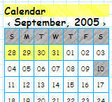
�Andy of Linux� sent his Quadrille Blog Theme into the battle. Basically, it shows a sketchbook with stuff on it. The used Comics Sans font underlines that.What I like here is the use of hatchings in for example the calendar. But the rest of the theme is too much �in your face� compared to the winners. A little bit of burned paper here, a little bit of pastell colours there and things would look different...
Andy entered the race with 3 validation warnings.
Simply Red

The gray involved is very stylish. Too bad the banner spoils it all. The sub-banner used (below “Home Page”) would have added a lot if used instead of the beveled red thing on top.
Only 1 validation warning here.
Also, did you notice? Lasse and I were the only ones who actually created custom “phpWebSite themes” banners...
| The comments are owned by the poster. We are not responsible for its content. |

What's Related
Article Manager
Themes
Latest Updates
AdministrativeTexts
updated by freddiemac1993, 2013-06-14
wiki
Re: adventures
created by brittdavis10, 2012-02-23 (1 rply, 3 views)
thread
Re: how to run phpwebsite...
created by alexander, 2011-08-25 (2 rpls, 3607 views)
thread
Re: Forum tags
created by HaroldFaragher, 2011-08-22 (3 rpls, 8488 views)
thread


